
Blue Shield of California
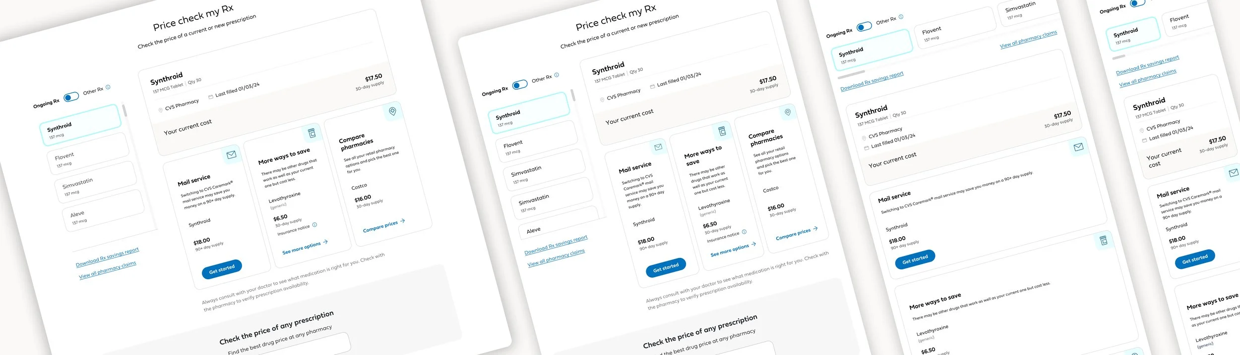
Price check my Rx
A first-in-the-nation digital experience that delivers real-time prescription prices and lower-cost alternatives to members before they arrive at the pharmacy.
Role:
Master Visual Designer
Team:
Product managers, engineers, content designers, clinical advisors, Gemini Health
Project Overview
Members often discovered the true cost of their prescriptions at the pharmacy counter—too late to make different choices. Partnering with Gemini Health, Blue Shield sought to address this gap with proactive, real-time cost transparency. I collaborated with product, engineering, and clinical teams to design a seamless integration into the member mobile app.
Price Check My Rx Tool
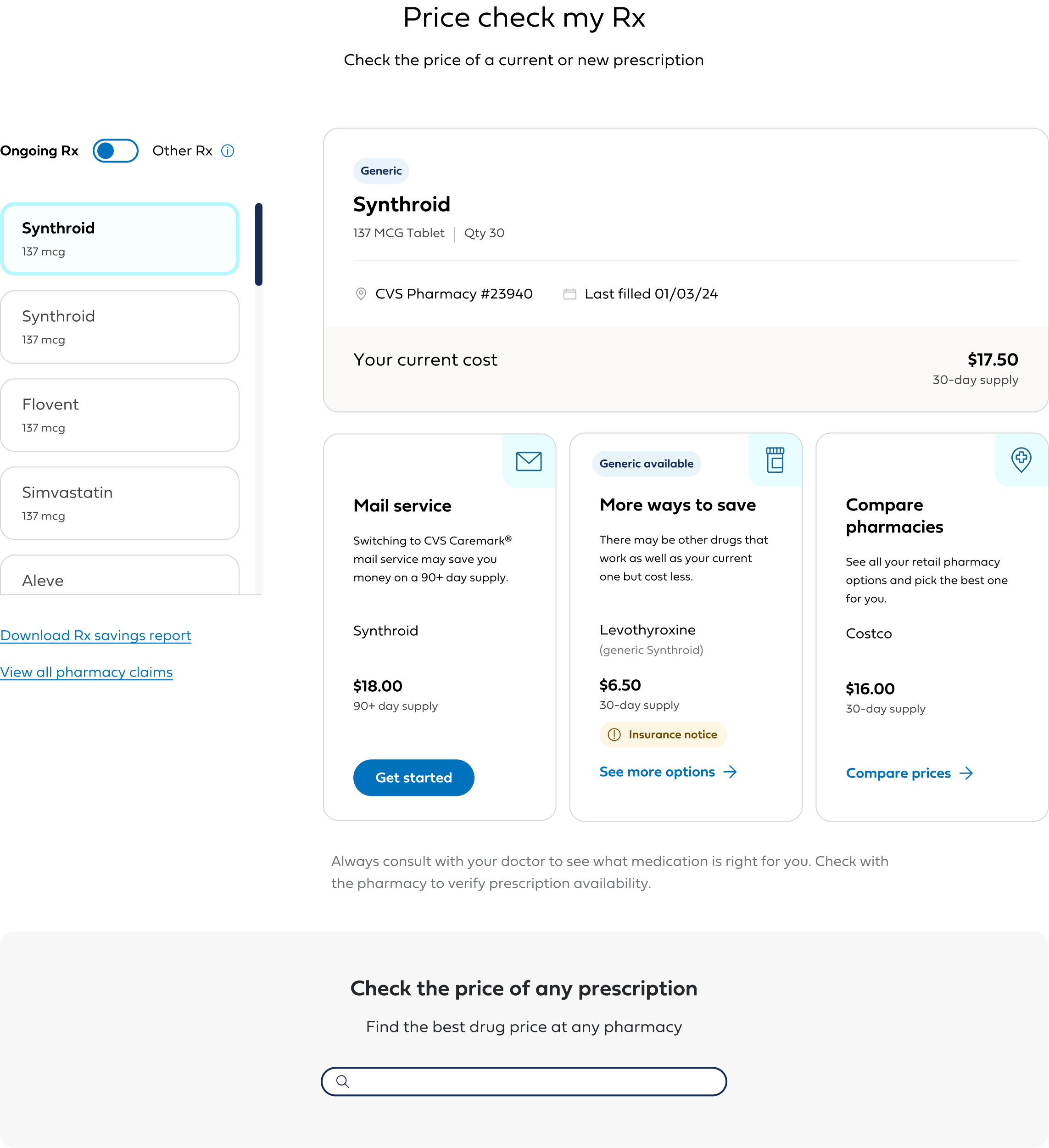
Members often discovered the true cost of their prescriptions at the pharmacy counter—too late to make different choices. Partnering with Gemini Health, Blue Shield sought to address this gap with proactive, real-time cost transparency. I collaborated with interaction designers and stakeholders to design a seamless integration into the member authenticated experience
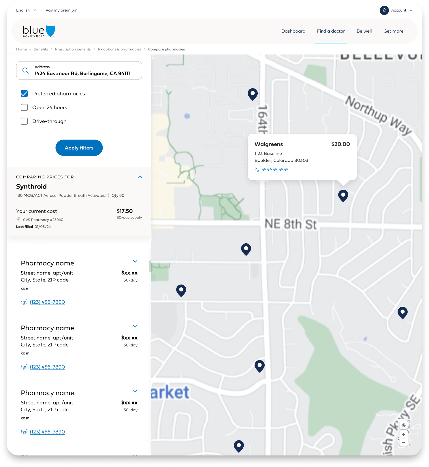
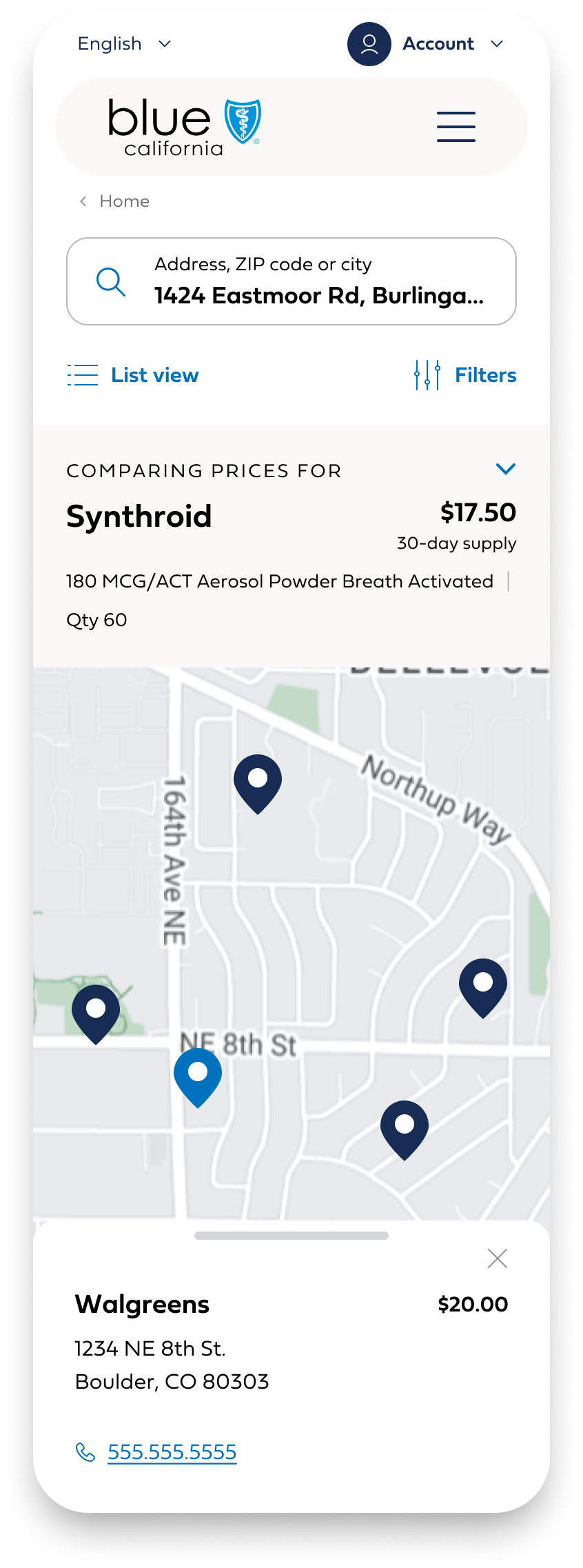
Pharmacy Comparison
When the user clicks on “Compare pharmacies” card, they are taken to a tool that allows them to factor in proximity along with pricing.


Rx Comparison
When a user clicks “More ways to save” they see a price comparison matrix of different pharmacies as well as generic alternatives of the same drug.
The launch established Blue Shield as the first U.S. health plan to offer member-facing prescription cost transparency. Thousands of notifications were delivered in the initial weeks with no spike in support calls—evidence of intuitive design. The tool built on more than $100M in member savings generated from earlier partnerships and set a new standard for digital health transparency.
Appendix
Mobile App Incubator
As part of the Digital Next Incubator, I participated in two intensive five-week design sprints focused on transforming key areas of the Blue Shield mobile experience. Each sprint began with a discovery phase, gathering user research and internal insights. In weeks two and three, we mapped real-world user journeys using the Jobs to Be Done framework, and in week four, we rapidly translated those flows into collaborative UX sketches and high-fidelity UI mockups.
Our cross-functional UX team—made up of interaction, UI, and content designers—worked closely throughout, ideating and iterating in tight cycles. The first sprint tackled login, registration, and onboarding, while the second focused on personalization and helping members better understand and engage with their benefits.
These blue-sky explorations became a proving ground for applying our new brand direction to the mobile app and elevating its visibility within the organization. The work laid the foundation for a full-scale redesign of the app—an effort I now lead as the principal UI designer.
COMPANY WIDE PRESENTATIONS OF WORK